Gallery Walls: How to Build One That Looks Collected
The bathroom belonged to someone who had been everywhere. Dark blue walls, rustic brass fixtures, earthy linens. Nearly every surface was covered with objects they brought back. Masks from places I couldn't name, things with obvious history and weight, a photograph here and there to anchor it. Color and texture held everything together. Warm tones, natural materials, things that had clearly been somewhere and done something. I stood there longer than made sense for a bathroom. I left thinking I had to try this.
That was the beginning of what became five gallery walls across my home. Each one different. Each one still growing.
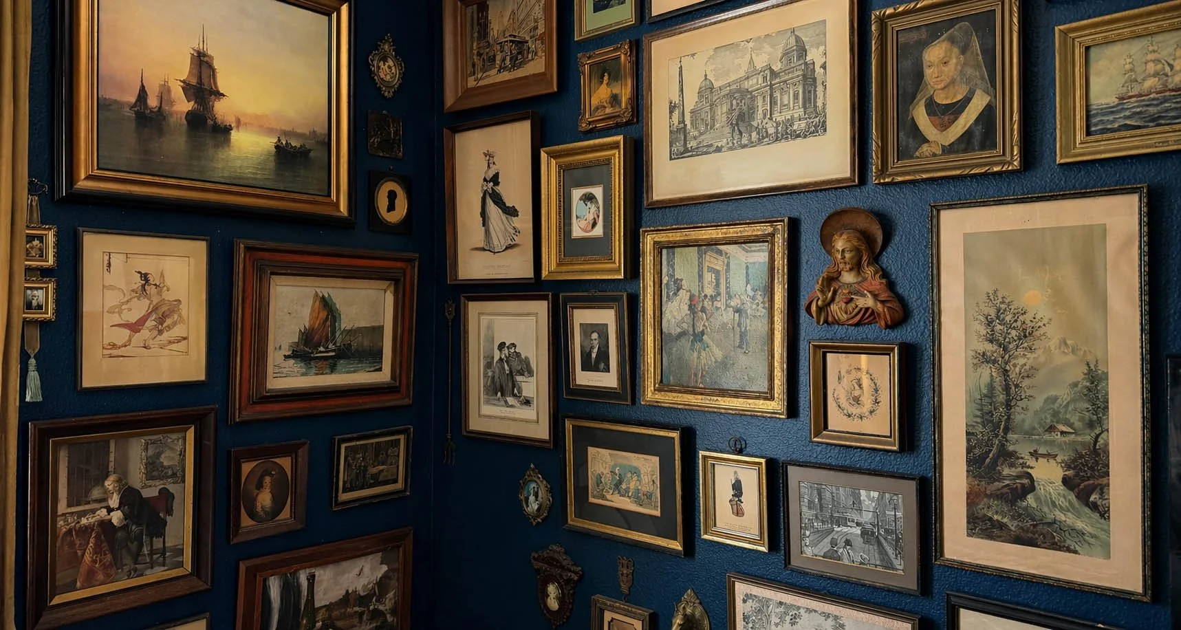
The uniting element
Before anything goes on the wall, decide what holds it together.
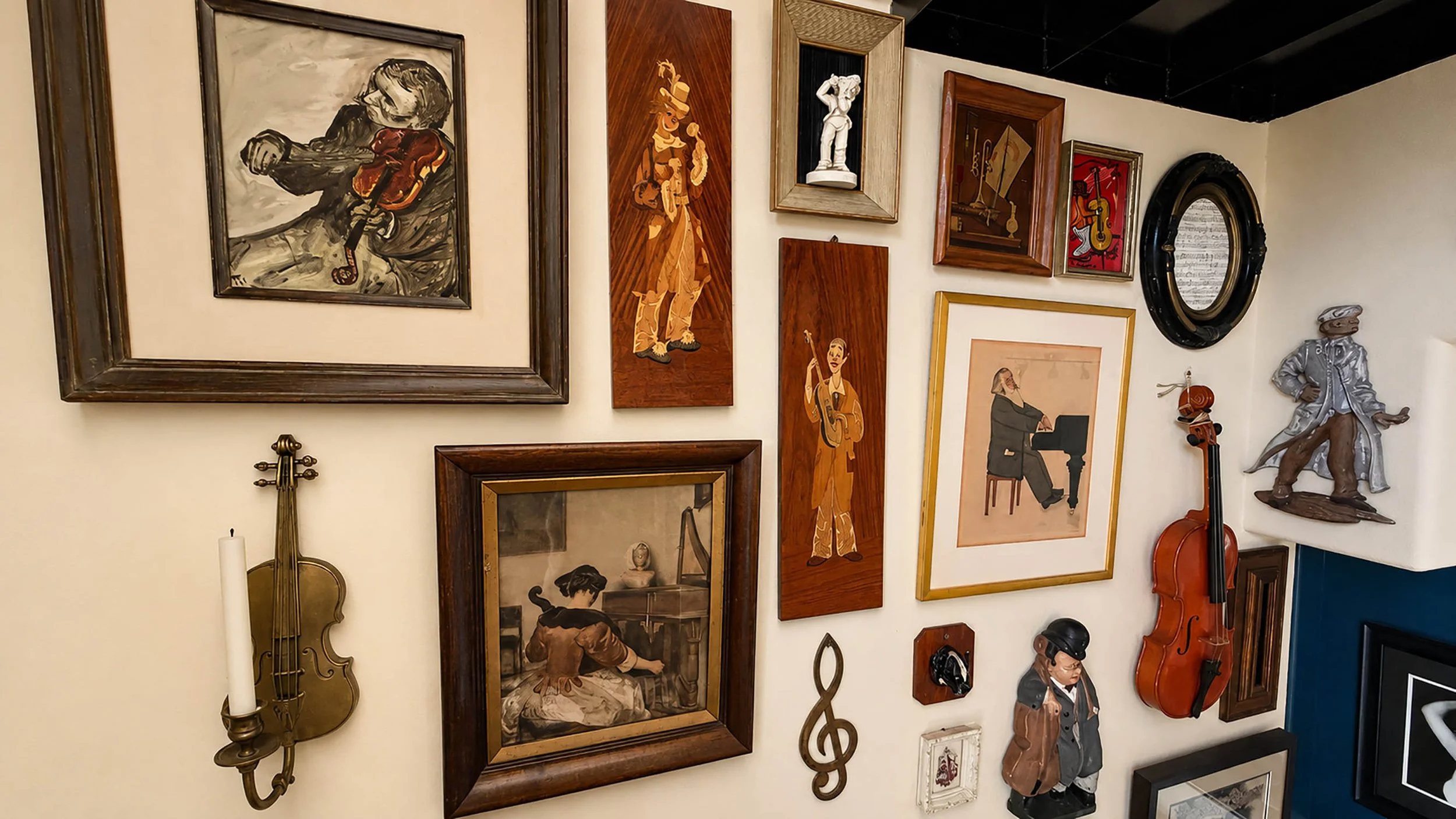
This works on two levels simultaneously. The first is subject. My bathroom is Hollywood and theater, 1920s through 1950s. The bedroom is pre-1800s imagery, historical and religious. The staircase is music. A friend covered an entire wall in nothing but playbills. Someone I know uses exclusively taxidermy insects. The subject tells you what to look for. More usefully, it tells you what to say no to.
The second is material. Gold and wood. Silver and light wood. Dark and aged. A frame that breaks the material palette doesn't belong on the wall regardless of what's inside it.
The frame is part of the composition.
Once both are established, the choices become almost automatic. You pick something up at an estate sale and you know immediately.
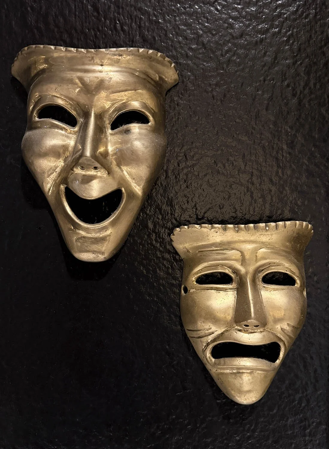
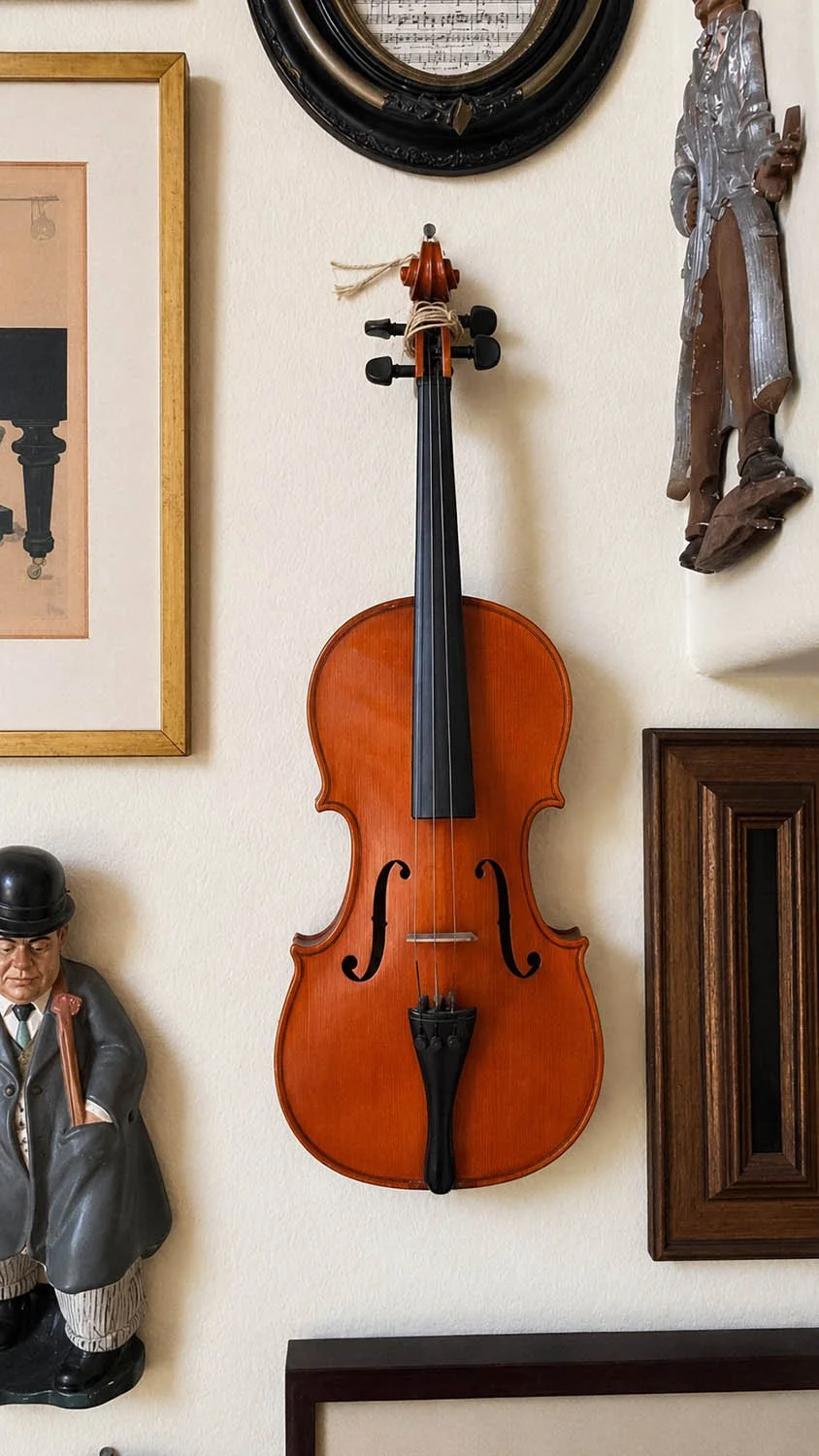
Frames don't need to match. They usually shouldn't. Different sizes, finishes, and orientations create the layered quality that separates a collected wall from a decorated one. Don't stop at frames either. My staircase has a violin mounted on the wall. The bathroom has brass theater masks and a swan vase among the frames. A chalk sculpture. A brass plate. Whatever belongs to the story.
The depth three-dimensional objects bring is something pictures alone rarely achieve.
Before the hammer
Map the wall first.
Lay everything on the floor. Move it around until the composition settles. Work out the shape. The density. Where it begins and ends. The floor costs nothing.
Cut paper templates to match each frame. Mark where the hanging hardware sits on the back. Tape them to the wall. Adjust until it's right. Drive the nail through the paper, remove it, hang the frame. The whole process takes the guesswork out and leaves only the eye.
The anchor
Every wall originates from one piece. It should be something that stops you. Something you would hang on its own.
Mine was a Folon aquarelle I found one Saturday at an antique market. I knew immediately where it would go. Everything else grew outward from it.
It doesn't need to be large. It needs to be right.
The spacing rule
The simplest rule is also the most important.
Every frame, regardless of size or shape, stays the same distance from every other item on the wall. I use two inches. Once that decision is made, every piece has a place. The wall grows outward until you decide it's complete. After the first few pieces are up, the templates come down and the measuring takes over. The system runs itself.
How walls grow
None of mine were finished in a day. That's not how they work.
I go antiquing most Saturdays. When I travel I bring things back. The walls absorb what I find over time and become a record of places and moments as much as an aesthetic position. The Folon poster came from a local market. The bedroom pieces arrived over several years of estate sales. The staircase violin came from a thrift store on its last day of business. Almost everything was gone. The violin was on the wall, missing its strings. My eye went to it before I had a reason.
It became the piece the wall had been waiting for.
The pieces only need to earn their place.
On editing
Every gallery wall improves when something comes down.
If a piece keeps drawing attention to itself rather than supporting the whole, remove it for a while. Collections aren't permanent. Neither is the first arrangement. The wall should feel intentional, not full. There is a difference and it shows.
The walls I live with
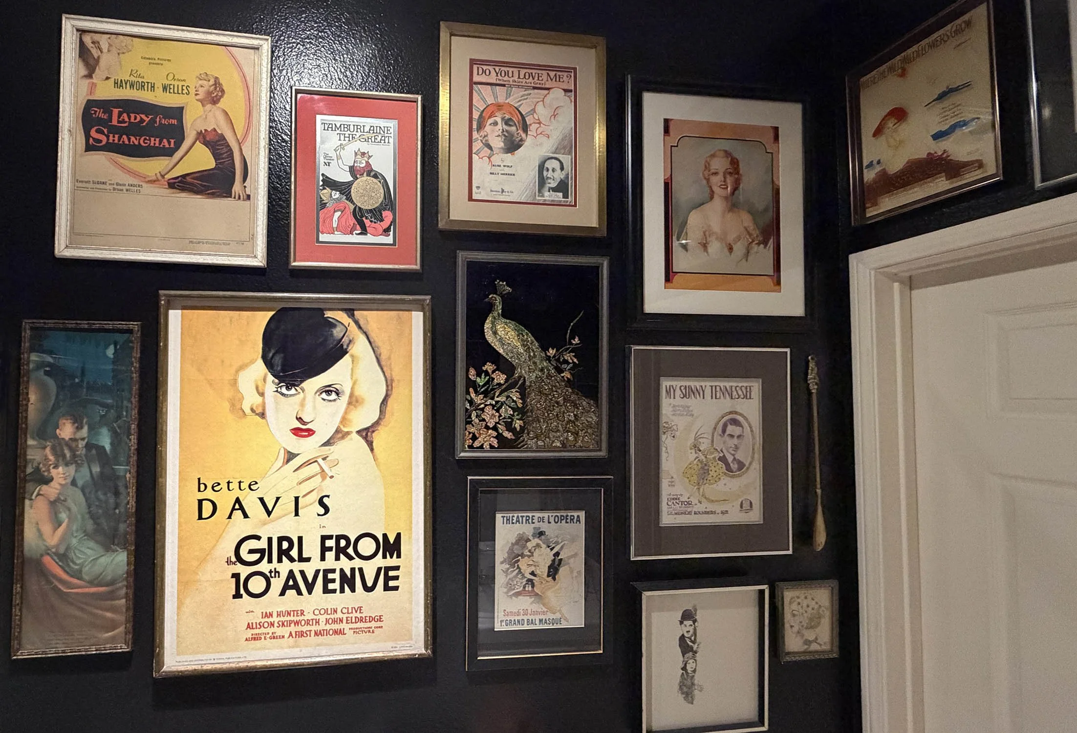
The bathroom. Black walls. Vintage Hollywood and theater from the 1920s through the 1950s. Sheet music covers, movie posters, performer portraits, brass theater masks. The uniting element is an era and an obsession. Guests linger here in a way they don't in rooms three times the size.
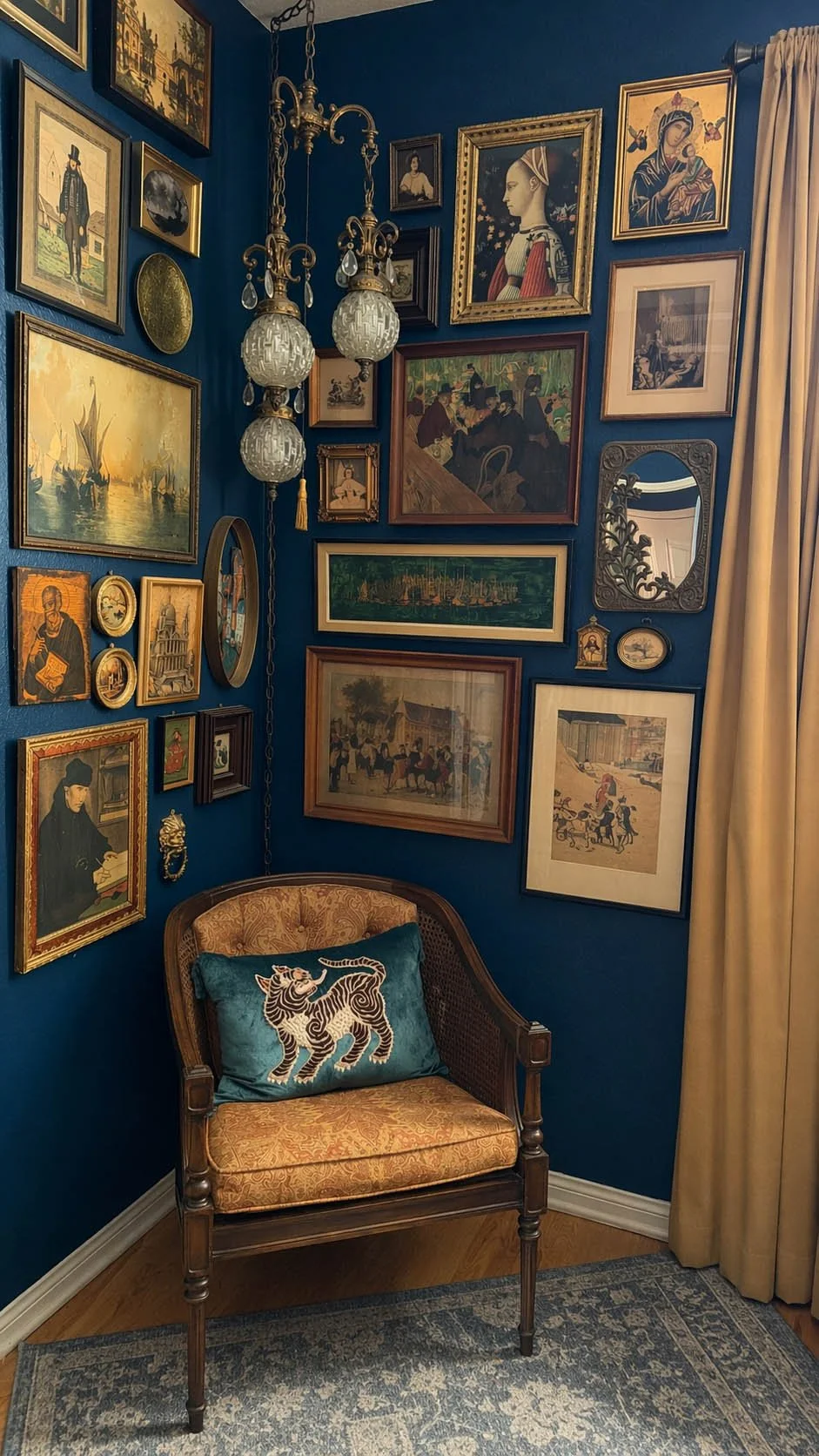
The Antiquarian Bedroom. Deep navy walls, floor to ceiling. Pre-1800s engravings, religious iconography, historical portraiture. Everything in aged wood and tarnished gold. Nothing arrived together and nothing looks as though it did.
The staircase. Cream walls wrapping a black spiral staircase. The theme is music. The architecture is part of the composition rather than an obstacle. A five-dollar violin anchors the wall in a way that still surprises me.
Above the desk. A lighter wall with a 1970s sensibility. Silver frames, light wood, the Folon poster at the center. A few clowns arrived as an afterthought and earned their place.
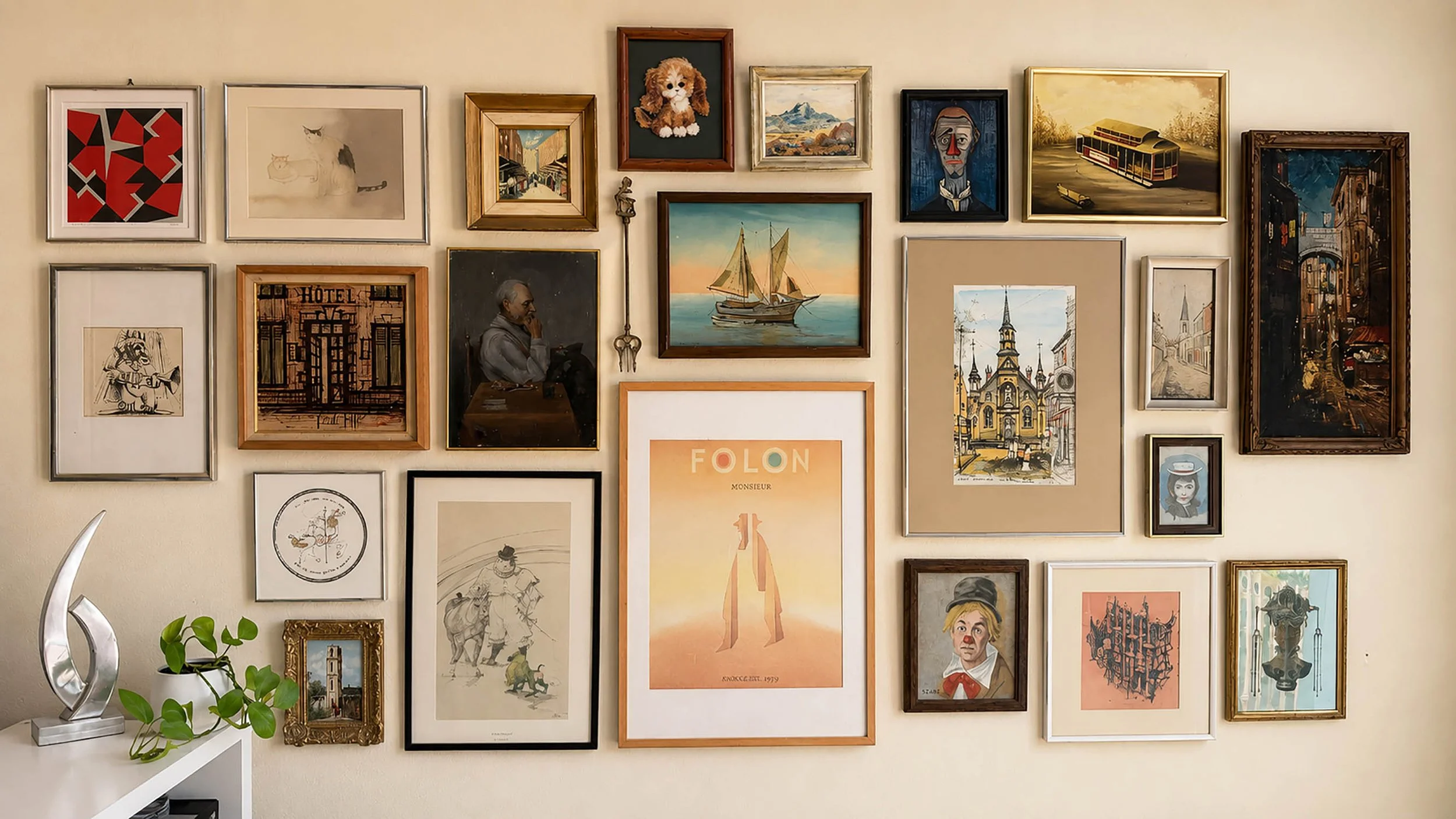
Each one is different. Each one is still growing.
Browse frames, prints, and objects across the Altered Bloom collections, or follow the full catalog on Pinterest.
Several pieces like these can be found through this curated Etsy collection.
Know where to hunt before the weekend.
A small edit of the estate sales, auctions, and shows worth knowing about. Free every Thursday.
