How to Style a Home Library for Dark Academia: What Restraint Actually Taught Me
Empty shelves can be more intimidating than full ones, especially when you’re building a dark academia home library from scratch. Stand in front of six open shelves with a stack of books and a table full of objects you love, and the possibilities start working against you instead of for you. I learned that building the shelves in my own study, one adjustment at a time, before they finally felt right.
I started loading each shelf with books standing upright, then working objects into whatever gaps were left. Brass pieces, a bowl, a small vase, all of it wedged between spines like it was competing for the same inch of space. Once I stepped back and actually looked, I could tell something wasn't reading right.
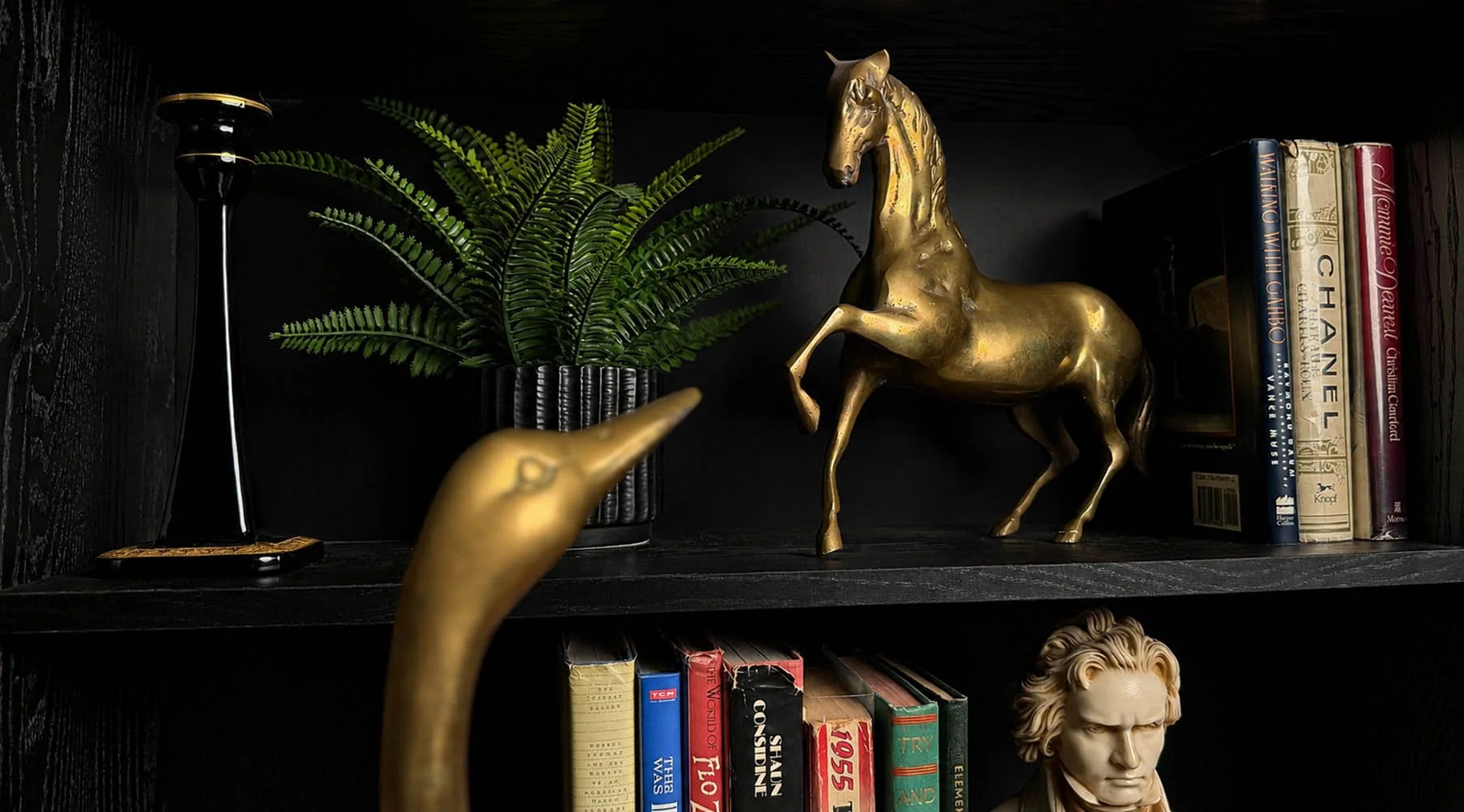
The shift happened on one shelf in particular, the one that ended up holding a brass horse I almost sold. I'd found it at an antique store for less than I expected and picked it up thinking I'd resell it, then brought it home and couldn't let it go. It took some moving around before I found where it actually belonged, and once it landed on that shelf, everything around it needed to change to make room for it properly. I pulled books back. I let a fern take up space that used to hold three more spines. I stopped stacking objects between books and started setting them on top instead. The shelf went from busy to composed, and that was the moment less is more stopped being an old adage and turned into something I could see working in front of me.
Almost every shelf that improved after that got better because I took something away, not because I bought something new.
Books don't need to match, and that's the point
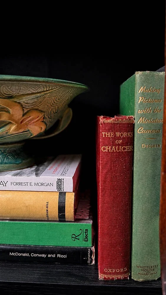
There's no rule that says books need the same subject, color, or height. Mine don't. I sort by size before anything else, larger photo books on the lower shelves, smaller ones moving upward, then fill in the rest by instinct, pulling titles from what genuinely interests me rather than what matches the shelf next to it. A shelf that looks too coordinated starts to feel like a retail display instead of a real collection.
Depth does as much work as height
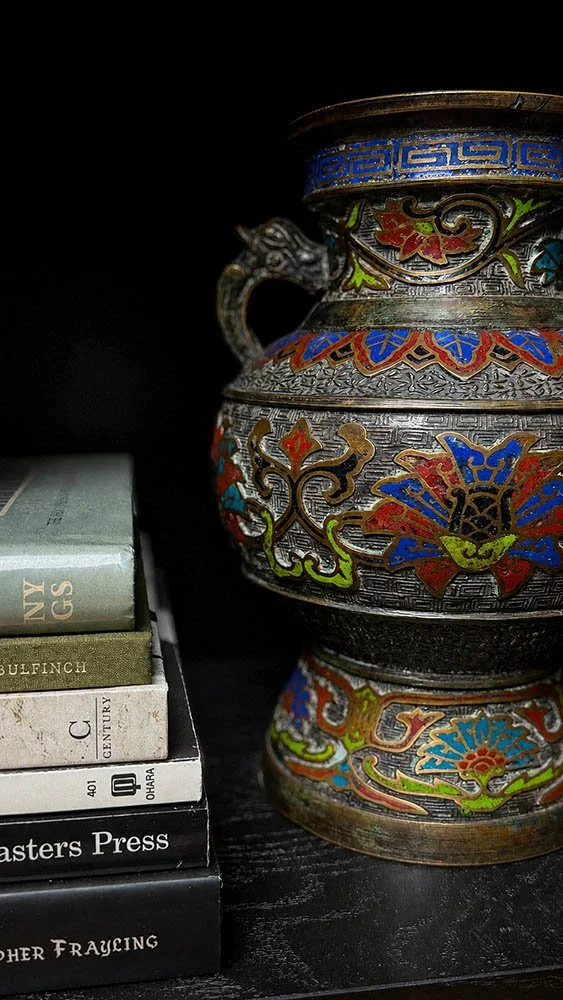
Height gets most of the attention when people talk about styling shelves, but depth mattered just as much once I started paying attention to it. I noticed it first with a pair of vases sitting on a cabinet top nearby, side by side at the exact same distance from the edge, and they read as flat no matter how good they looked individually. Pulling one slightly forward and letting the other sit back gave the grouping real layering instead of a lineup. Once I saw that, I started doing it on the shelves too, one object closer to the edge, the next one settled behind it, and spots that had felt static suddenly had somewhere for the eye to travel.
A test for when something feels wrong
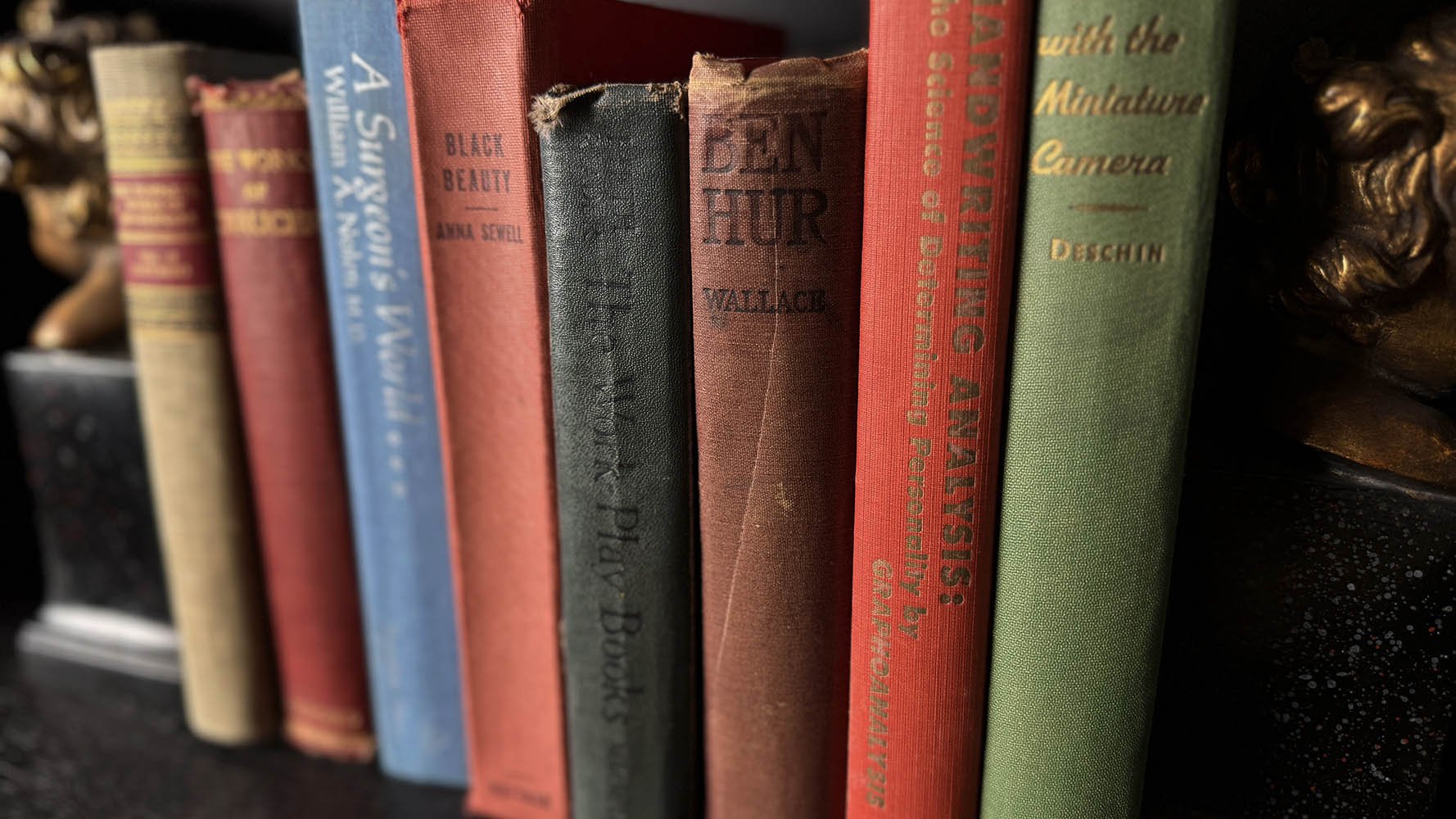
When a shelf still felt off after adjusting, the tell wasn't in the shelf itself. It was in how my eye behaved. I'd look away, then look back, and if something immediately pulled my attention out of the corner of my eye, that told me exactly where the problem was. I later found out this has a name, the walk-away test, which made sense once I heard it. It almost always points to the same issue: something sitting alone, either in height or in color, with nothing nearby to balance it. Grouping objects in odd numbers, three instead of two, helps. So does pairing a taller anchor piece with smaller supporting ones, spreading the dense, dark, or metallic pieces around so no single stretch of shelf feels loaded while another goes flat. A small antique globe works well in that role too, its curved shape reading differently against a row of straight book spines than another brass or glass object would."
Objects matter more than volume
I ended up with fewer books than I first pictured, and more objects, once I saw how much room each one actually needed to breathe. What worked for me landed close to what I later learned is a fairly common guideline, somewhere around 70 to 80 percent books to 20 to 30 percent objects, though a real home library can hold more books comfortably than a living room shelf can, since a living room starts reading like a bookstore past a certain point. Brass shows up more than once across my shelves, on a horse, a swan, a lantern, typewriter hardware, and I don't think that was ever a plan so much as a preference. I gravitate toward brass and tend to avoid too much material mismatch without really deciding to. Repeating it in a few places ended up doing more for cohesion than I expected from something I wasn't consciously controlling.
One shelf I left deliberately quieter, the one holding an old mantel clock. In a dark room, a black clock against a black shelf nearly disappears at night, but it keeps its presence and texture during the day. That same instinct carried down to the shelves near the television, where any brightness or clutter close to the screen pulls at my eye even when it's off. Keeping both areas calmer than the rest gave the busier shelves around them more room to feel rich instead of competing for attention.
The objects that found their place by accident
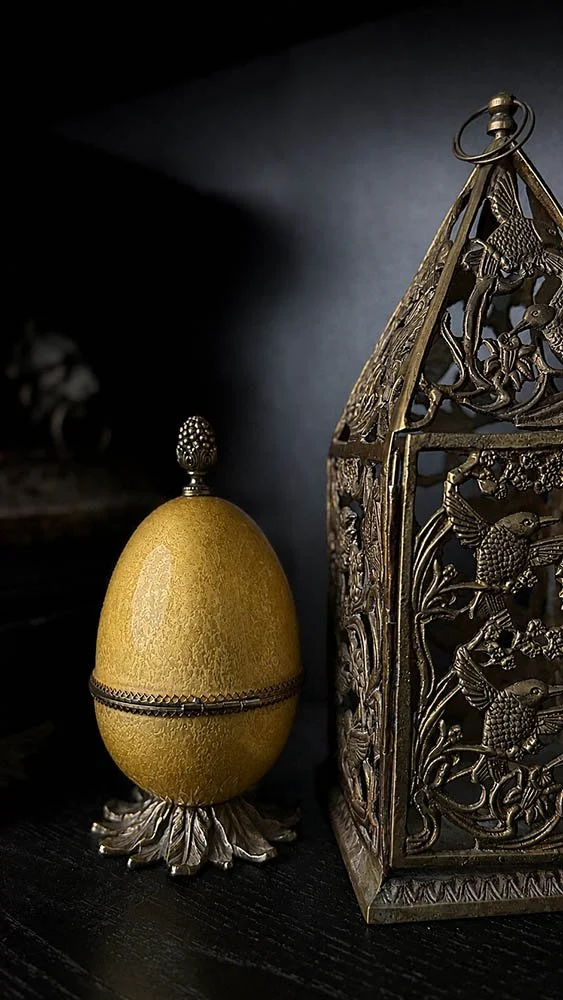
Neither the horse nor the pierced brass lantern beside it was bought for this shelf. I found the lantern because I hadn't seen anything quite like it before, and only once it was home did I realize it balanced the horse's brass instead of competing with it. A small enamel egg box sits beside it now, the kind of quiet object that never asks to be the focal point but earns its spot anyway.
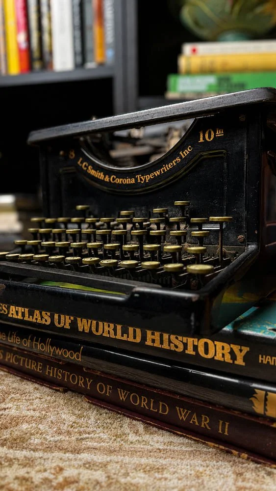
The typewriter on the lower shelf has moved with me for years, found originally at an outdoor antique market. I've always liked the idea of objects and books living somewhere they don't strictly belong, on the floor, stacked under something functional, the way you'd imagine a stack of coffee table books left out on an afternoon with jazz or classical music playing low, tea going cold while you thumb through pages without any real hurry. I went looking specifically for book spines to sit under the typewriter, choosing them by color and size rather than title, since anything going on the floor under a heavy object shouldn't be something precious. The stack also does double duty as a small platform, giving the typewriter somewhere to sit above the books instead of alongside them, the same trick that works with any object that needs a bit more presence than the shelf alone gives it.
I've also leaned framed photographs against the back of a shelf, rather than standing them upright. It felt more secure, and standing a frame up always read a little too much like display to me, more gallery than library.
What I'd tell someone staring at an empty shelf
Start with size. Sort books by scale before anything else, largest low, smaller as you move up. Add books first, a few per shelf, then bring in the objects you actually love and watch where they seem to want to sit. Step back often, and trust what pulls your eye. The shelves that feel most like a real library are rarely the fullest ones. They're the ones with enough room left to actually see what's on them, not because they hold less, but because I took something away to get there.
More of this material lives in The Dark Study, and the clock garniture on these same shelves gets its own telling in Art Deco Clock Garniture Styling.
Know where to hunt before the weekend.
A small edit of the estate sales, auctions, and shows worth knowing about. Free every Thursday.
